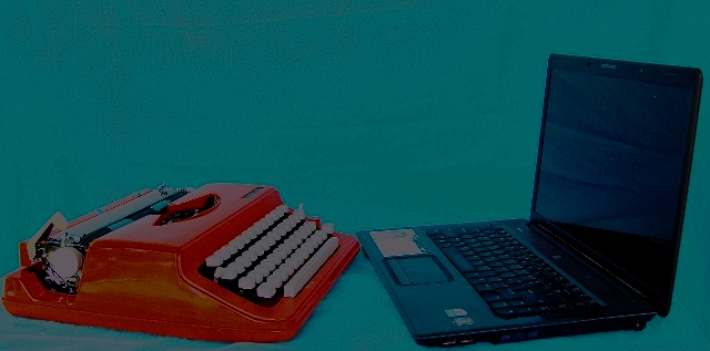
hmm.... its not a nice picture, for several reasons:
The contrast between blue and red is harsh.
The quality is poor.
The contrast is very strange, a lot of detail has clearly been lost.
Too dark.
I think it could have been a nice picture without these problems, good luck next time :-)
Good concept! I don't like the green backdrop - perhaps a more neutral colour would have been better (white, black, cream?). Also, I think I can see creases in the fabric which you could have tried to iron out before shooting.
The idea is OK, but technically this is way off the mark - lighting, background, noise, exposure, focus, composition. Perhaps it was all deliberate but it doesn't work for me.
Sorry, but I thought I should justify the low mark I have given.







 Add photograph to your favorites
 Add photographer to your favorites


