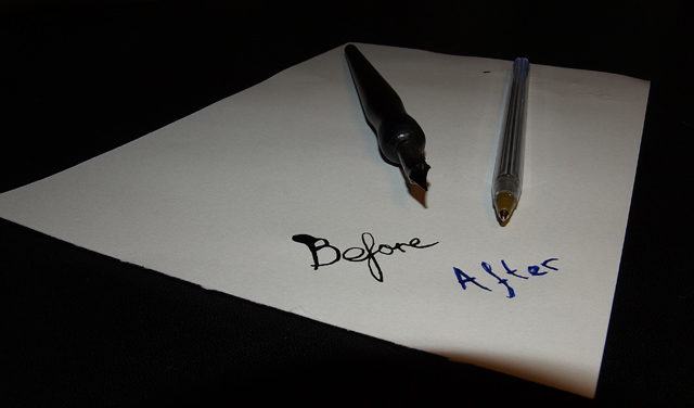
I think if you had a quill instead of a calligraphy pen, this would've worked better. It could also use more/better lighting, and the front corner of the paper is oddly shadowed and distracting.
Interesting idea. I feel that the cropping is odd. The chopped off left corner of the paper looks out. Also, that shadow on the lower right corner is quite distracting.
Nice literal interpretation, and the handwriting fits well. The shadow on the front of the paper is distracting. If this were lit from an extremely low angle--so that it brought out the paper's texture--I think it would have been better.
Good idea, but I think your execution leaves something to be desired. I think if you had more light, or softer light, we'd get to see more of your pens.





 Add photograph to your favorites
 Add photographer to your favorites


 Photographer found comment helpful.


