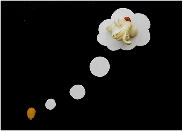
Converted from Raw, shifted the gamma offset to make the black paper blacker (came out a bit grey)
Lighting caused a headache until the husband suggested reflected light and then all of a sudden it got much much better!
Theres an annoying spot and the slight redness on the corn is annoying but it was either that or grey background which looked worse.
Probably get a 5.1 for this
Statistics
Place: 37 out of 143 Avg (all users): 5.8325 Avg (commenters): 7.3636 Avg (participants): 5.7308 Avg (non-participants): 5.8705 Views since voting: 1455 Views during voting: 360 Votes: 191 Comments: 16 Favorites: 0
Underrated, i loved your idea!! Very clever and funny, I just think if the saturation and contrast was a bit higher it would've given a nicer punch to it
Nice idea, but the circles kind of make it kernel look like those thought bubbles you would see in cartoon and comics. Almost as if the kernel was thinking about being popcorn. Lighting is good and I like how I can see some of the detail on the piece of pop corn.






 Add photograph to your favorites
 Add photographer to your favorites

 Photographer found comment helpful.


