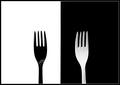
A nice image. I thought of this too, but went with something else instead. I think maybe just a little lighter to bring out more detail would be nice. good shot.
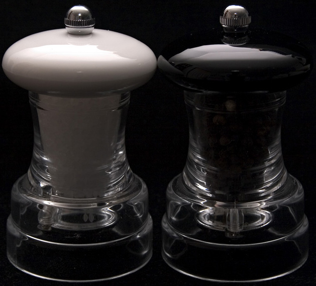
I think the cropping is powerfull and the B&W reduction silky and strong, on the whole a good graphic image. My only beef is that I think of salt and pepper as two things that go together, with more similarties than differences. Same can be said of the subjects in about one third of the entries, but this is such a good shot it is my only criticism.
Ii don't know if I would call Salt and Pepper Opposites so much as complimentary of each other...
The peppe rmill doesn't have that much definition to it, mostly due to the darkness of the background. Maybe there is something that could be done with the lighting or perhaps with a different background color that could pop out the shape of the peper mill a little bit better.
Nice job! I thought about trying a picture like but didn't want to face the wrath of the voters. You're brave and I hope you fare well. I like it though...






 Add photograph to your favorites
 Add photographer to your favorites


 Photographer found comment helpful.


