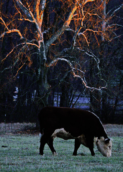
That is true red sunset light on that tree. Lots of processing, with crop, shadow/highlight, curves, hue/sat, selective masks, etc. etc., a true offense to my lazy nature... all for a brown contender. The things I do for you people!
Statistics
Place: 160 out of 167 Avg (all users): 4.4000 Avg (commenters): 4.0000 Avg (participants): 4.1212 Avg (non-participants): 4.6067 Views since voting: 781 Views during voting: 276 Votes: 155 Comments: 10 Favorites: 0
So, I get to critique a Posthumous image - good job these are randomly generated. Don't shoot me :)
I am pretty sure you are aware of the reasons why you did not score higher, even without reading others comments or mine. I actually scored this a 6 because I loved the light captured on the trees and it was refreshing to see something other than a landscape for the subject. I do find the area just behind the cow to be a little too dark for my taste, but difficult lighting at that time of day.
I could add to others comments that the positioning of the cow was too central, or that the top of the tree was chopped off etc, etc, but really I believe those comments would be superfluous. It is a pity the trees are slightly out of focus too.
I haven't figured out if you were genuintely going for the brown or not.
Sorry I have not added any substance to this critique, but you know, it's pretty challenging to to critique this one!
Sarah
Is it just me, or does that cow have an oddly huge head? Nice light in the trees but the processing turned blown highlights into vibrant aqua bits. Who's to say they weren't there, though?
I'm afraid that what you have done (pro bono diphoco) is only slightly outrageous: your eye for colour and form betray you, and there is a cow. Vivat bovinia.
I gave a low score so I should justify it. I think the black point has been set too high which makes the cow look flat, there is a good deal of noise in the face of the cow too. Also, there are some blown highlights in the upper branches of the tree. All correctable.
Composition-wise I think chopping off the top of the tree doesn't do a lot for the image. Goodness me I've said too much, and actually I'm not good enough myself to be so bold with my critique; but I do think I should justify my score.
Subject-wise, I think there would be quite a lot of potential here but a lot of it goes unrealised.
I like that we can see the sun rays on the tops of the trees. That said, this does feel like it's lacking something to me, perhaps it's a little dark in the foreground?





 Add photograph to your favorites
 Add photographer to your favorites

 Photographer found comment helpful.


