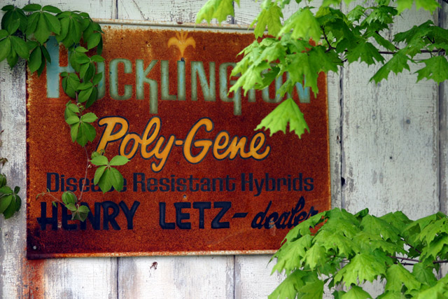
Feels like its lacking sharpness, and there is too much competition between foreground and background. If someone could have helpd back those two branches on the right while you shot it would have worked better for me.
Composition: Subject Placement, Cropping, Background 9
Technical: Focus, Exposure, Lighting, Processing 10
Appeal: Is it Interesting, Motivating, Etc.? 7
How well does it meet the challenge: 10
Total Averaged Rating 9.00 Dick
great color saturation. maybe a higher dof would look better, the leaves on the right are slightly out of focus. Maybe you wanted it that way, either way, it looks great. 8
Nice to have the green leaves in the foreground, good composition, But its a little overexposured under the rusty sign, and I think the leaves on the right doesnt add to it cause theyre not in focus, good luck :)
Composition: Subject Placement, Cropping, Background 5
Technical: Focus, Exposure, Lighting, Processing 5
Appeal: Is it Interesting, Motivating, Etc. 6
How well does it meet the challenge: 9
Total Averaged Rating(Rounded) 6
I really like this. The paint, rusted sign, and old advertisement juxtaposed against new spring growth. Can't do much better in summarizing the human condition. Photographically I cannot think of anyway to improve. Excellent work.






 Add photograph to your favorites
 Add photographer to your favorites


 Photographer found comment helpful.


