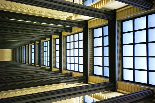
The ceiling of one of the sections in the Musée d'Orsay, Paris.
Rotated through 90 degrees, slight crop, slight contrast and saturation adjustment, resize.
Post-challenge:
-=-=-=-=-
Oh wow! I never expected a second ribbon so soon! This did much better than I hoped for! My week has been made! Thank you for the wonderful comments and support, everyone!
Statistics
Place: 2 out of 133 Avg (all users): 6.8805 Avg (commenters): 8.0000 Avg (participants): 6.6341 Avg (non-participants): 6.9661 Views since voting: 5524 Views during voting: 246 Votes: 159 Comments: 26 Favorites: 4 (view)
Haha, nice composition, I like the way you've kept the orientation in landscape (i assume it WAS intentional? ;) ) it adds to the "What the...?" effect!
Simple, elegant, sharp, composed of only straight lines, while not being boring. This is what this challenge should be all about. We have colour, contrast, shaddows, highlights, dark patches.......Everything.......
Great Submission. Best I have see so far......Well Done





 Caught in a Matrix
 Add photograph to your favorites
 Add photographer to your favorites


 Photographer found comment helpful.


