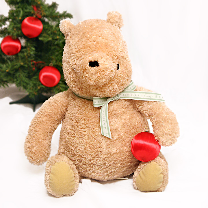
I agree with you that this probably deserved better than it got (it's better I think than the photos that placed near it). It's very bright and vivid and immediately says "Christmas." However on my monitor it seems over-exposed (the white almost hurts my eyes).
Paul - A nice Christmas card shot - I wonder if a slightly different composition would have helped here. I think the tree in the background is good to provide some color and contrast, but it seems to unbalance the image. In addition, the whites seem a bit bright on the screen - it probably will look great printed out
His eyes are so low, that looks a little strange to me. Personal teddy bear biases aside though, I think there is a little too much negative space for me in this.






 Add photograph to your favorites
 Add photographer to your favorites

 Photographer found comment helpful.


