Greetings from the Critique Club (and welcome to competition -- your first photo for Something New II)
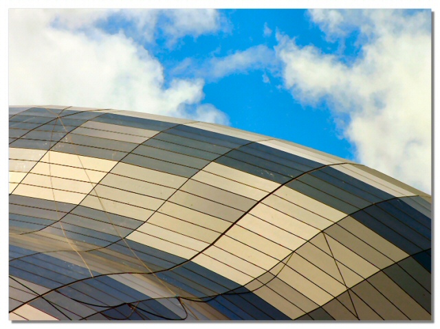
I like your composition - the placement of the main subject (building) at an angle gives the shot an abstract quality (that several other comments seemed to like as well). I agree that the sky seems to detract. I think that it's a fine sky but doesn't "go" with the muted tones and geometric shapes so my eye fights back and forth from building to sky. A flatter sky (adjusted in post processing) may have provided a more neutral backdrop.
The lines that cross at the diagonals are distracting as they distrupt the curves and patterns you created in the rest of the shot. These curves and patterns are well done and the way the light changes the colors on them give the shot extra interest.
We all look forward to more of your work.
Please pm me if you have any questions on my comments
Composition: Subject Placement, Cropping, Background 6
Technical: Focus, Exposure, Lighting, Processing 6
Appeal: Is it Interesting, Motivating, Etc. 5
How well does it meet the challenge: 8
Total Averaged Rating(Rounded) 6
I like the curves of the lines and the contrast between the regular and rigid pattern of foreground and the complex patterns of barely controlled chaos in the background. I do not see how the drop-shadow border added to the composition however.
I like the thing whatever it is but I think it would look nicer without the sky for some reason I also like how you have done your border
Good focus and detail 7
Would have given you 9 if the sky was not in frame. I feel theres a better image just using the abstract shapes and curves of the roof. But I still gave it a 7.
Not sure what this is, not that it matters, but those 'extra' lines, the less geometric ones, kind of upset the fluidity of the image for me - it's otherwise so perfectly abstract, and I'm not convinced that they add much. Not that you could just have popped up and removed them of course, but nevertheless ...






 Add photograph to your favorites
 Add photographer to your favorites

 Photographer found comment helpful.


