First Submission using my new D90. Still learning all the buttons on it, but glad to finally upgraded.
PP in LR2.1
Blue Channel Shift (Sat, Hue)
Brightness and contrast
Vibrance/Fill Light/Exposure and Highlight shifts
Desat on Red Channel
Crop and Resize for Web
Statistics
Place: 70 out of 239 Avg (all users): 5.6154 Avg (commenters): 4.8333 Avg (participants): 5.6167 Avg (non-participants): 5.6147 Views since voting: 970 Views during voting: 266 Votes: 169 Comments: 8 Favorites: 2 (view)
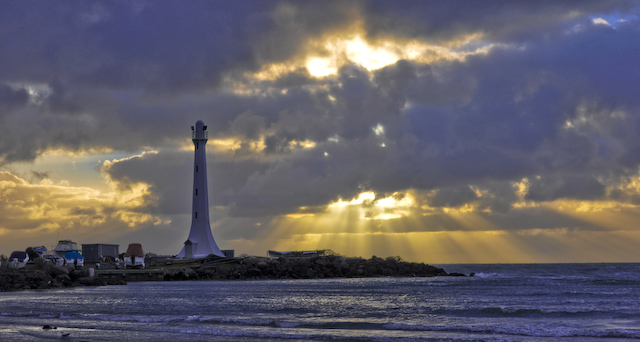
Camera Work/Technical: I can tell that the focus on the image is ok, but the haloing around the lighthouse really takes away from any quality that the image may have had. I also think that you did the scene an injustice by taking desating the red channel. The image looks very cold, though my eye wants to think it should look warm.
Lighting: The lighting of the sunset or sunrise is spectacular on its own, but my eye jumps right back to the lighthouse. I am not sure if it was dodging or some other adjustment, but the lighthouse looks very unnatural.
Composition/Content: I do like your composition. Every element serves to help the image flow, as well as keeping the eye moving through and exploring the frame.
My Opinion: I think that the voters were fairly generous with your end score. There are obviously several technical flaws that kept this image from reaching its full potential.
Thank you for the opportunity to provide a critique on your entry,
Eric
I'm not sure if there was some tonemapping, or if you adjusted highlights/shadows, but there's noticeable haloing around the lighthouse, at least on my monitor. I do like the tones you've captured in the clouds.






 Add photograph to your favorites
 Add photographer to your favorites

 Photographer found comment helpful.


