Excellent image - well exposed, clear and relevant to the project! I don't get so much verbal poetry out of this, but I do appreciate it for the image - the shadows, quality of light, composition...
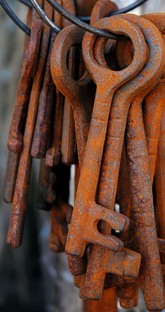
Great detail. I would like to see the entire ring of keys, the cropping is too tight, or the depth of field should be smaller if you want to focus only on one or two.
Great cropping and depth of field. This image does a great job of focusing you on the subject, and has enough detail to keep you interested without background distractions. This gets a "less is more" award in my book.
Composition: Subject Placement, Cropping, Background 8
Technical: Focus, Exposure, Lighting, Processing 8
Appeal: Is it Interesting, Motivating, Etc. 7
How well does it meet the challenge: 7
Total Averaged Rating(Rounded) 8
Should place very high.
Nice subject. I think you overextended on the color, though. Lots of that going on in this challenge! Struggled with my submission's levels and went for a more" realistic" rust color--not sure that helped me at all..... Otherwise, I think you've got a great pic here. It seems appropriate that only one key is fully in view. Thanks, and luck!
Composition: Subject Placement, Cropping, Background 7
Technical: Focus, Exposure, Lighting, Processing 9
Appeal: Is it Interesting, Motivating, Etc.? 6
How well does it meet the challenge: 8
Total Averaged Rating 7 Dick
The incongruous nature of the medium lends a vague congruity in and of itself. Circulars of rust, in coupling with the unrusted ring, becomes the most tangible of congruosities. And it is this that detracted me.
Even with the background lost to circles of confusion, it still interferes, but even so the incongruity of the unrusted rings with the rusty keys, the cropping of part of the collection and the rather haphazard falling of the keys all detract for me.






 Add photograph to your favorites
 Add photographer to your favorites


 Photographer found comment helpful.


