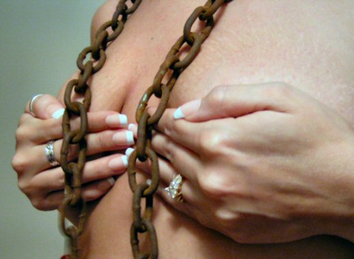
I think that this may have been a good idea for the challenge, but a few things are keeping this from being a good image, in my opinion. first off, the focus seems to be off on the entire image. I can't really find a strong sharp focus, and soft focus doesn't work here. I'm thinking a few things happened with that. First off, see the bottom of the chain on the left side? It looks like some motion blurr there. Which could be the same reason that the rest of the image looks soft. Low lighting or camera shake can both be reasons for this. Since the background seems darker, and there are dark shadows, I'm guess that lighting was the main problem here. Second, the rings are way too distracting in the shot. I don't really like the shadows, they seem kind of 'snapshotty'. I guess it just doesn't look like you nurtured your photo, add a bit of lighting, maybe try a tripod to reduce camera shake, and clean up the photo. The rings are cluttering. While there is nothing wrong with the imperfections in the skin, I do find that they draw attention away from the rusty chains which are really suposed to be the subject here. So, while I like the idea, I think that this feels rushed, and snapshotty. Sorry to be long winded...hope this helps some. ~Heather~
Composition: Subject Placement, Cropping, Background 7
Technical: Focus, Exposure, Lighting, Processing 6
Appeal: Is it Interesting, Motivating, Etc.? 8
How well does it meet the challenge: 10
Total Averaged Rating 7.75 Dick
Your focus is quite soft, and I feel the picture would have been more powerful if it were done fully exposed. With the hands in the picture unchained, the effect becomes subdued.
Composition: Subject Placement, Cropping, Background 6
Technical: Focus, Exposure, Lighting, Processing 4
Appeal: Is it Interesting, Motivating, Etc. 6
How well does it meet the challenge: 7
Total Averaged Rating(Rounded) 6
Focus is somewhat soft.
So many meanings you imply with your title. Interesting composition. I'm not sure I would hae used quite so heavy a chain. I'd really like to know more of the story behind this photo. 9 for bravery and audacity.
Lighting is too flat. You would have done well to soften the light and perhaps give it a yellowy hue. Also, there is significant motion blur on the bottom of the left chain and the entire image is generally badly focused. The composition is not so bad. I might have even wanted to see less of the top and bottom of the image (i.e. cropped so just the breasts are in the frame). The rings on the hands (and to an extent the hands themselves) are a distraction to the point being made, which is not altogether very clear to me.
I would like to see this done in black and white - I think the colurs distract from the image a bit. The jewelery takes the focus off the chains a little.
The focus seems a little soft on the chain and the whiteness of the nail tips is rather distracting from the overall composition as well as the blur at the bottom of the chain.
I think the background washes out the image. The foreground hand is also out of focus, and the chains seem to be lackign in sharpness. The rings are a bit distracting as well; It seems like the focus of the image is the chaining of a body rather than the body's jewelry.
This was an interesting idea. I think it might have worked better if it were the chain rather than hands hiding the nipples and without the rings. Perhaps the chain would have been wrapped around a few times for better coverage. Also, lighting and focus could be better here.





 Add photograph to your favorites
 Add photographer to your favorites


