Author Thread
Post actions
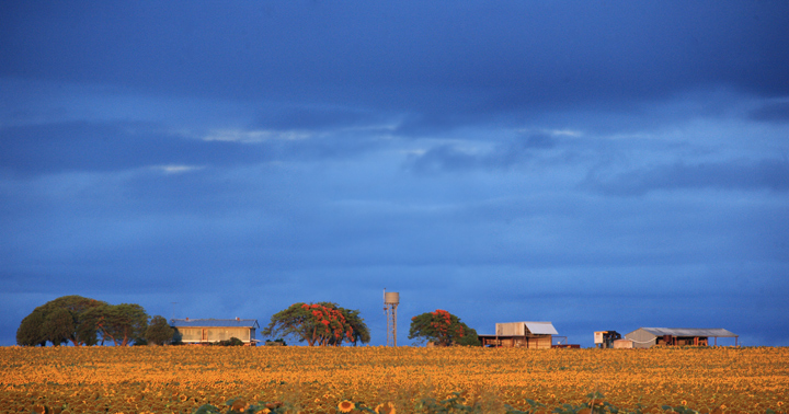
Someone made the comment that this was oversaturated but I didn't use any saturation. This is pretty well how the original looked.
Comments Made During the Challenge
Post actions
Oversaturated. The sky is not the most important part of the frame, why is there so much of it?
Post actions
I like the empty space here, I think it's well lused and makes the scene pop.
Post actions
The colours are nice in this but I find the subjects being all in a straight line makes the photo feel flat. Shooting the subjects at more of an angle to the side may give the photo more depth
Post actions
Beautiful shot, and fantastic use of negative space
Post actions
I really like the "white space" (blue space) here. The scale is terrific. (not voting yet)
Post actions
OK overall...not sure I can say anymore to help here...






 Add photograph to your favorites
 Add photographer to your favorites


 Photographer found comment helpful.


