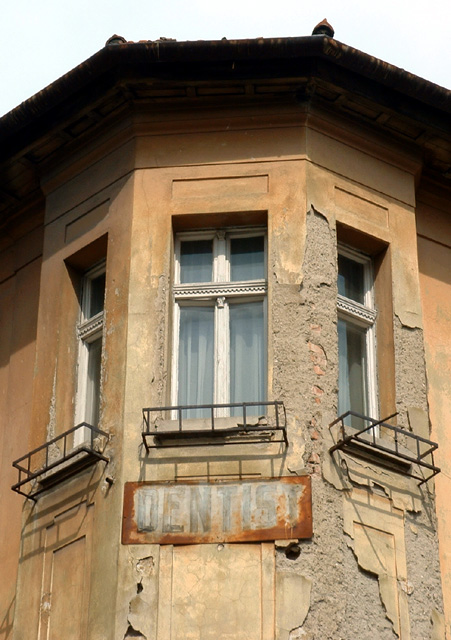
I love this subject - the sign is wonderful as is the building with its peeling paint and stucco. I'm not sure if the angle is quite right though - I wonder if a straighter angle wouldn't be more pleasing. The proportions, focus and exposure are excellent.
Composition: Subject Placement, Cropping, Background 5
Technical: Focus, Exposure, Lighting, Processing 7
Appeal: Is it Interesting, Motivating, Etc.? 5
How well does it meet the challenge: 8
Total Averaged Rating 6.25 Dick
I feel a different angle, not so centered would help this a whole lot. somewhat overexposed.
Composition: Subject Placement, Cropping, Background 6
Technical: Focus, Exposure, Lighting, Processing 6
Appeal: Is it Interesting, Motivating, Etc. 4
How well does it meet the challenge: 7
Total Averaged Rating(Rounded) 6
Neat architecture. It looks like this was taken from slightly off center, which may have been your intent. I'd like to see it from a head-on symmetric POV as the symmetry of this shot could be interesting. Also not sure you needed to leave so much sky in the crop. It's almost too bright in contrast to the rest of the image.
Hmm an interesting one. I like your choice of subject, the building & sign have a lot of character. Perhaps getting close would make it even more striking.






 Add photograph to your favorites
 Add photographer to your favorites


 Photographer found comment helpful.


