Nice showing with your first entry -- welcome! (in case you don't know -- marking "helpful" the comments you received during the challenge that were helpful is a way of aknowledging those that took the time.)
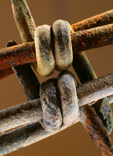
I don't have much to add to the comments below -- I'll just highlight the ones that are true for me. The lighting, while harsh, gives the edge to the composition and let's it match your title (without this the title is contrived and without anchor in the frame)
The color and macro approach let me get close to the subject to study what you saw in it. The elements are complex enough to hold my interest and connected enough to paint a cohesive picture. I tried the shot in landscape format and wonder if it improves the composition?
Composition: Subject Placement, Cropping, Background 9
Technical: Focus, Exposure, Lighting, Processing 10
Appeal: Is it Interesting, Motivating, Etc.? 7
How well does it meet the challenge: 10
Total Averaged Rating 9.00 Dick
Nice composition, nicely graphic use of line and tension (althouh I want to see the points, this is perhaps part of the tension), good lighting and contrast on the subject. The background color is bland and doesn't contribute or support the strength of the subject. I'd suggest a more saturated color, one that's opposite on the color wheel from the color you're trying to emphasize.
Composition: Subject Placement, Cropping, Background 8
Technical: Focus, Exposure, Lighting, Processing 8
Appeal: Is it Interesting, Motivating, Etc. 6
How well does it meet the challenge: 8
Total Averaged Rating(Rounded) 8
Composition: Subject Placement, Cropping, Background 6
Technical: Focus, Exposure, Lighting, Processing 7
Appeal: Is it Interesting, Motivating, Etc.? 5
How well does it meet the challenge: 7
Total Averaged Rating 7
(scale borrowed from auool and being tried out by me)





 Add photograph to your favorites
 Add photographer to your favorites


 Photographer found comment helpful.


