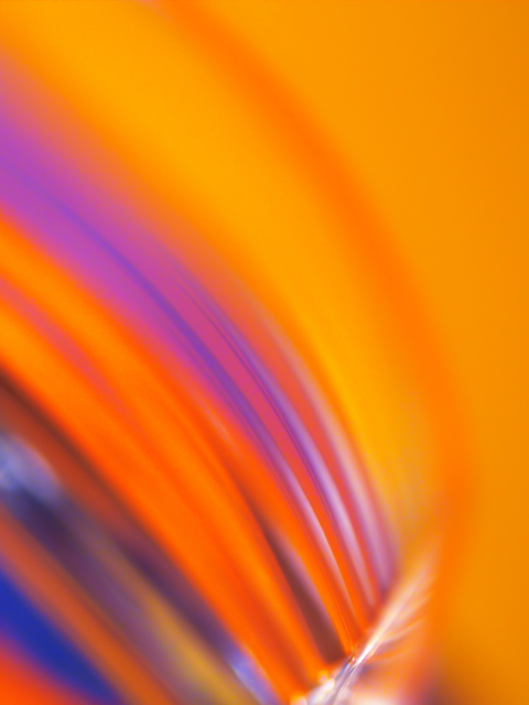
Like the colors and the composition....there is to much plain in the upper area and the right side....a closer crop might have been used. not too, but enough to lessen the vast amount of plain.
Composition: Subject Placement, Cropping, Background 9
Technical: Focus, Exposure, Lighting, Processing 9
Appeal: Is it Interesting, Motivating, Etc.? 9
How well does it meet the challenge: 7
Total Averaged Rating 8
Colors are very striking. I love your use of negative space. The curving diagonals are just beautiful. No suggestions for improvement from me as it is already well-composed and well-thought of. I hope this makes it to the top ten or top ten percent at least.
Well done with good colors. I would suggest thinking about a way to reduce the orange area at the top and side. Maybe a square crop might have given it a bit more attention to the interesting curves and foreground colors.





 Add photograph to your favorites
 Add photographer to your favorites


 Photographer found comment helpful.


