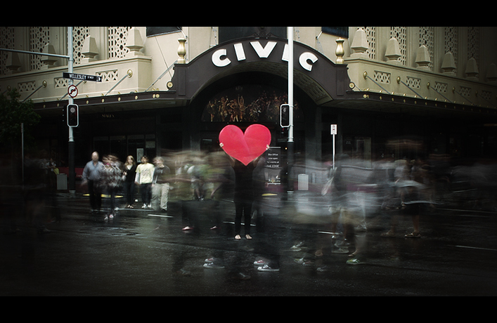
this is so awesome. what a fun shot! what is amazing to me is that it doesn't even look like anyone is staring lol - like they might be used to seeing this kind of stuff. excellent idea. congrats on the top 10!
The only thing I don't like about this is the very dark right corner, I think this would've been fine without the vignette. Otherwise, I love the image; full of life and motion, imaginative and attractive.
I like that the person holding the heart is wearing black to blend in the background. the action blur of the city really makes this image! One of my favorites, it should be a ribboner.
Good idea... nice to see a bit of effort in the challenge. This idea could have been even stronger with a better composition though (IMO) also a slower shutter if possible.... makes me want to go and try something similar...
I really like the feel and tone of this, it's one of my favorites for this challenge. My only thought might be that the people in front of and to the right of the person with the heart are moving a little too much and are too numerous, making it a little too busy. Just my opinion though, and I really like the photo a lot.
I like they message it conveys. The people walking around add motion to the photo, giving the photo a "I will always be here for you" feeling. I could stare at this photo for hours... it really tells a story for me.
Great composition. The left side of the photo feels all a little darker than the right and it gives the photo a slight uneven feeling. The unevenness probably comes from the person to the right wearing liter clothing than those people on the left.
I also like the use of the desaturated colors except for the hart. I can really tell because of the stop light and the street sign because they aren't distracting
I really really like this picture, everyone walking by, almost without noticing a man standing with a giant heart. You did great here. The tones/colors are amazing. 9
I do like the idea and the overall outcome of the shot, but I think your vignette is a bit too tight or the image is too dark as a whole.
I can see how your artistic intent might be to have the strong darkness, but coupled with the muted colors it would be easy to pass this image over without noticing it.
I wonder if you could have cloned out that pole running through your "I".






 Add photograph to your favorites
 Add photographer to your favorites

 Photographer found comment helpful.


