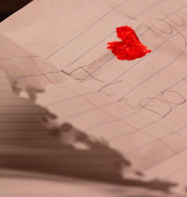
I really like the concept here, but the image itself is lacking, I'm afraid. Out of curiosity I popped it into my photo editor and found that some levels, curves and white balance adjustments really improved this in a big way. The white balance made the biggest change to it, making the paper look a more realistic white.
Exposure seems to be a bit off, the heart is a little to neon, and the composition could have been better. If the paper completely filled the frame, you wouldn't have the dark area that has a touch of noise. The shredded edge pulls my eye away as well as the fact the lines are fighting with the heart for dominance. It would have been cute to have 'circle yes or no' written in a childs hand.
The basic idea is good but the execution perhaps needs some extra attention. The large out-of-focus page detracts from the point of interest so much that it's not easy to see what this picture is all about if you removed the title
You managed to make the heart stand out. I don't know what kight you were using, you will need to adjust your WB to make the white paper apear real white.
I think your lighting is wrong here...
A Levels Adjustment or adjusting the Exposure would have helped here. I'm not sure how you shot this with the lighting an all but it looks like you just used ambient lighting from the room. If you have a flash you could bounce it off the ceiling and it would give you some better light. OR... take a desk lamp and hover your object but place a sheet of white printer paper between the light and the object to diffuse it.







 Add photograph to your favorites
 Add photographer to your favorites


 Photographer found comment helpful.


