Well, it looks like a brown ribbon is in the bag for this one.
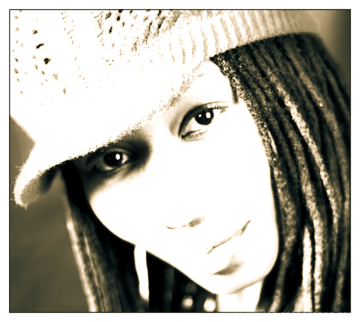
Everyone wants to see her nose. I love the shape of her face, and that is what I was trying to feature with this image. The nose didn't add anything to the image, in fact, it distracted from the lines of her face, hair, and cap. I felt there was enough of the mouth to give a feel for her expression, and to me, the shadow under the nose is enough to indicate it's existence.
Some comments (e.g. too much dark in the image) seem to indicate that high key can only be for white chicks with pale blond hair against white backgrounds. I disagree, and I like the contrast of the dark hair against the blown out skin.
I agree that it would be better with sharper eyes. But other than that, I am very happy with this image.
Statistics
Place: 166 out of 170 Avg (all users): 4.5482 Avg (commenters): 4.8000 Avg (participants): 4.4674 Avg (non-participants): 4.5792 Views since voting: 1178 Views during voting: 556 Votes: 332 Comments: 28 Favorites: 0
I thought that I made a comment on this one but must of missed it. I voted a 9 and thought it was great, whether it fits the high-key genre or not is irrelevant to me as is the need to see a nose…who cares if you can’t see a nose thats more important to the technical perfectionist.
Very well done high key. People judge high keys very differently but this is a very good attempt at it and shouldn't have gotten such a low score. Her nose comments are laughable, we see enough of it to imagine the rest. Remember Monroe's line about the head being cut off in a close up? 'People know he has one...' I think it applies here.
I think this image has a lot going for it, but IMO what hurt the score was the implication that you were going for high key. I'm getting more blown out spots than high key. The hair certainly works for this type of image, as does your crop and composition. What I do to get these images to work (at least in my mind) is to convert to B&W, add a layer in screen, then another in soft light on top of that, and fade the screen layer as needed. You get a great high contrast black and white that is mostly high key.
The high key kinda knocks out some of the detail in her expression. I don't need all the detail but a bit more would help me to know her a little better.
Despite the high key affect, I wish there was more detail visible in the lips and nose... I do really like seeing one eye in shadow from the hat though.
cool model, cool hair, cool pose. I don't care for the over exposure effect here as I think you have lost too many of her interesting features. I get that it was intentional, but I think it is overdone here.
To me this is not high key, but overexposed. High key to me is an image with nearly only highlights but still with all the detail remaining in the highlights. Also an high key image has a certain light atmosphere to it. Your image contains too much dark tones in my view, is missing the atmosphere of a highlight picture and the highlights are overexposed and without any detail.
This is wayyyy too bright for my taste. However, your focus is good. I prefer high key images that are a bit more toned down so they retain texture and detail. Good luck :)
The editing is perhaps a little too much for me, but I find it interesting how there are little patches of fuzzy detail among the blurred sections. neat.
I love high-key shots.
And this is great, just wish it was a tad sharper in the eyes.
Nice use of contrast tho, the dreadlock dark hair works well with this.







 Add photograph to your favorites
 Add photographer to your favorites

 Photographer found comment helpful.


