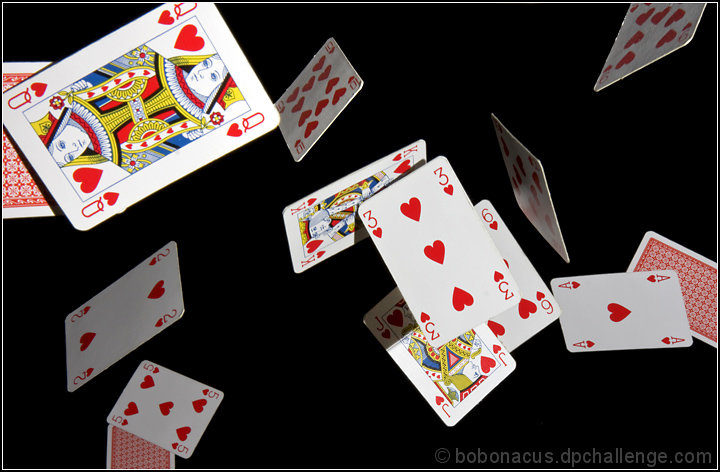
Hazel threw the cards whilst I laid under the camera which was facing upwards. Lit with speedlight off camera. The queen, ace and 5 are all clamped and the rest are two cards stuck together so it didn't matter which way up the cards were when they were tossed in the air :) Black cloth pinned to the ceiling.
Convert from raw with very slight crop. A little dodge on the shadow on the jack. Increase saturation of reds by 20%. Resize, usm and save.
Post Challenge I realise the lighting isn't perfect and the shadows may be a little annoying but I really don't understand the 2's and 3's at all?!?
Statistics
Place: 64 out of 105 Avg (all users): 5.3836 Avg (commenters): 6.6667 Avg (participants): 5.1957 Avg (non-participants): 5.4602 Views since voting: 905 Views during voting: 284 Votes: 159 Comments: 11 Favorites: 1 (view)
Hey what'ya know, I get to critique your photo :D cool.
To start with this is not a 5.3 picture, worth more than that. So why didn't DPC give you better vote?
Composition is very nice. I like the spreading of the cards randomly, further cards out of focus which is also nice. Shadows and reflections are right on the money here. It truly matches the challenge, and it's quite of work to do this, some people just don't understand the work behind some of the photos.
Technically very good photo, I like it a lot. There are only few minor things that couth my eyes, but should not be the reason to give you 3 or 4 or 5s.
The edges of some of the cards you can see something was there and taken out with Photoshop. Just a point or two and right top corner card has more edge problem.
If I did vote, I would give 7 or minimum 6 to this photo.
Keep up the good work, nothing is wrong with you a lots of things wrong with DOC voters sometime, don't let it get under your skin.
Lots of hearts! Were these thrown and quickly shot or somehow placed in those positions? Either way looks sort of difficult. The lighting is a bit harsh and there are 14 cards.
Interesting, and I am sure a lot of work, good depth of field, good color, good contrast, I am not sure but maybe closing some of the black space and lessening the cluster in the middle might help (but it might not either)
Very clever shot. I look forward to Photographer's comments about how this was made.
Given the rim of the 9 & 10 of hearts - is the lighting too harsh?
Wonderful effort!
Fun card shot, I love the feeling of motion here and the composition. Don't care for the flash shadows on a few of the cards, but I see how that might not have been avoidable. Subject is ordinary.







 Add photograph to your favorites
 Add photographer to your favorites


 Photographer found comment helpful.


