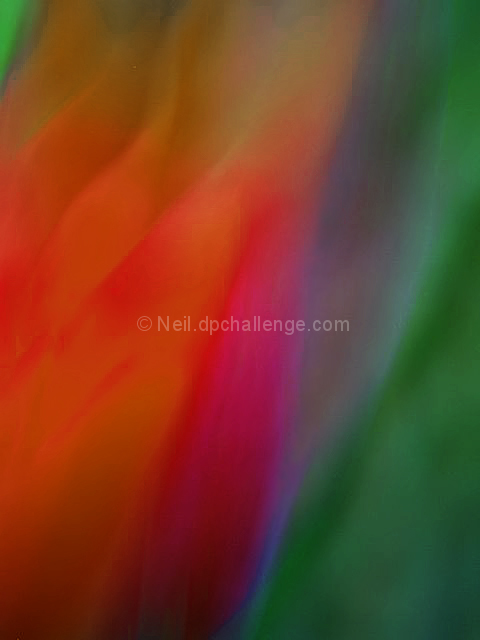
I spent all week taking pictures of flowers and other things shaking the camera, as I have seen and been inspired by Andrew Chambers work (www.abstractflower.net). He has an incredible talent for this! It's much harder than it looks!
Overview: No filters applied
Processing:
Shot in Raw format
Converted to JPEG via Breezebrowser (48 bit color)
Normal settings, reduce to 480x640, USM
Save to JPEG (24 bit color)
In PSe (24 bit color):
Copy All to new Layer;
Adjusted levels/color of new layer (missing details of this step)
Change Layer Blend to Screen
Add Hue Saturation Layer:
Reds: Hue +24 Saturation -1 Brightness -14
Add Levels Layer:
Input Levels: 41, .46, 255
Noise reduction - neat image
Cloned out a little pixelated noise.
Statistics
Place: 57 out of 208 Avg (all users): 5.6821 Avg (commenters): 7.8667 Avg (participants): 5.4653 Avg (non-participants): 5.9861 Views since voting: 3726 Votes: 173 Comments: 24 Favorites: 24 (view)
I love your motion blur pictures, this is something I have been playing with a bit with my horses recently, and you are soooo right, to get these "right" or so they look appealing is much more difficult than it appears!! Beautiful shot as are all your others
Yeah, that's really a great shot. I'm guessing that your score suffered from the painterly quality- it looks like it was run through a watercolor filter or something. This is one of those shots that gets killed for assumptions that aren't true. If the voters could see the first paragraph of your comments, this likely would have made the top ten.
I haven't voted but if I did, this is my pick for the ribbon. I like the colors and the lighting. It also hit the abstract theme right on its head. YOU are a WINNER in many ways.
Composition: Subject Placement, Cropping, Background 10
Technical: Focus, Exposure, Lighting, Processing 8
Appeal: Is it Interesting, Motivating, Etc.? 10
How well does it meet the challenge: 9
Total Averaged Rating 9
one of my ribbon picks this challenge - excellent colors and feel
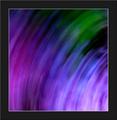
Very pretty colors and nicely blurred to make a beautiful abstract. The only major fault is the tiny white spec near the top. Clone that out and smudge slightly the mottled area to the left of the dark green on the right side of the frame and you'll have yourself a great abstract. It would look good next to most modern color abstracts you find in art galleries. I like this one a lot.
I would not have known it was a tulip without the title; now I can see it. That makes it recognizeable as an object. And I really liked this one, too. Bummer.






 Add photograph to your favorites
 Add photographer to your favorites

 Photographer found comment helpful.


