Greeting from the Critique Club (you have the dubious honor of being my first!!)
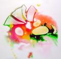
Meets the challenge topic for sure, wonderfully undefineable abstract
I really like the shifting colors and "bubble" feel. You've worked the refracted light well and by varying the colors added to the interest. I agree with others' comments on the lower part, a bit more variation of color/light would help. A bit of "too much of a good thing"
Charming...like the colors....wish the lower area of the amber orange was not so dark, but the abstractness of the gold shapes at the bottom make up for that a bit. Very nice...now idea what it is so it makes for a great abstract.
Is it jam and marmalade on a light box? not entirely sure, so well done! The lower half is considerably more beautiful than the top (the light effect (refraction?) is more prominent at the bottom) so to me, it seems a trifle unbalanced (it could actually be trifle, could it not?). I would have cropped out some of the red i think as you have a remarkable effect in the lighter areas. still, very good and quite intriguing. 8.






 Add photograph to your favorites
 Add photographer to your favorites

 Photographer found comment helpful.


