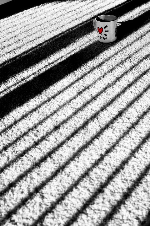
Technically, not bad. Nice contrast, I can see about everything without hurting my eyeballs LOL... which is good. Heart on the cup is definitely the attention point. What kicks me is the shadow of the handle. You should of touch that up, get rid of, kill it, painted... just take it out of there.
Composition is good, but I would definitely crop it more to get rid of the shadows on top left corner, and have the cup closer. San Diego is a nice place, I never been there but Melvin from Madagascar thinks so :P
5.4 probably where it should be. Lines are very nice by the way, good capture, nice idea. I actually like the cup in the shadow so it wouldn't create its own shadow... that would probably break the order there.
Overall a very nice improvement for your challenge photos, keep up the good work :)
This is very interesting to look at, the lines, textures, the shape of the glass. I could do without the words diego at the bottom of the mug but it doesnt bother me much. 8 and add to fav :)
Use of the shadows and the idea of a jail is cute, although the cup's role is only as carrier of the heart....somehow it isn't singing to me. I would have liked the cup further down in the image...there is a lot of area that is out of focus in the image.
Is that an "I Love San Diego" mug? Extra point for that. ;-) Otherwise, I love the cell shadow but it may have been better to have the subject, the mug,out of the shadow. The carpeting in the cell is pretty unrealistic.






 Add photograph to your favorites
 Add photographer to your favorites


 Photographer found comment helpful.


