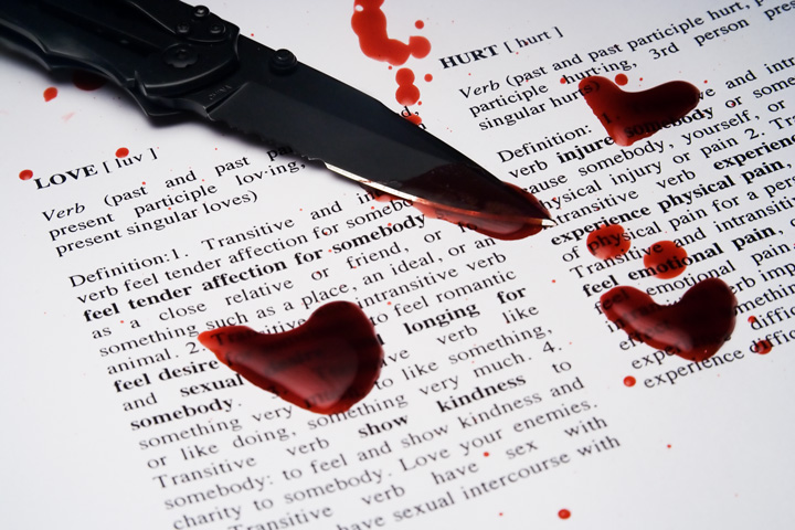
I initially thought this challenge was "love" when I took the photo. I had originally had just normal looking blood drops. Then I noticed that the challenge was "Hearts". I got the idea to do heart shaped blood drops from an associate(newmilfordct) on flickr.
I figured most folks would take a photo of a heart to represent love, but I wanted to put a slight spin on it. I wanted to show that love can be painful when it is lost.
Photo was taken with a normal 100w tungsten lightbulb housed in a cheap lamp fixture with a piece of white cloth as a diffuser. A pocket knife was used and the definitions for love and hurt were taken from the web and I put them in word to format them to my liking. I then printed the definitions out on a printer.
Modifications to the photo:
Color Selection - To give the blood a darker color
Curves - To increase contrast of the paper and text. Removed the curve from the knife portion of the photo since it made the knife too dark.
Unsharp Mask
Neat Image
The blood droplets were made from a mixture of Karo syrup, red food coloring, a little bit of flower, and tad bit of cocoa powder to give it that darker color.
Post Challenge:
I am glad this photo made some people uncomfortable... that was my goal.
I am a little disappointed in the results overall. I had a score of 5.28 in the last hour and somehow it got dashed down to its current score. I wish those who gave me scores below 4, especially those who voted 1 or 2, would have given me a reason why they voted so low. In my opinion, a score of 1 is uncalled for without a reason. Was it the message?
Statistics
Place: 72 out of 105 Avg (all users): 5.2595 Avg (commenters): 5.2000 Avg (participants): 5.2444 Avg (non-participants): 5.2655 Views since voting: 28907 Views during voting: 305 Votes: 158 Comments: 11 Favorites: 2 (view)
Compositionally, this shot is nicely balanced. The elements in the shot complement eachother, without being overpowering. I agree about the comment about the words filling the frame. For whatever reason, the white space around the definitions doesn't add to the shot, imo. Perhaps a tighter framing, or more definitions to fill it up, would help. As it is, the eye is almost drawn to that clean white spot.
Technically, you have done very well. Your blood, gruesome as it is, looks very much like real blood. The focus is good and the lighting is well balanced. It might be a hair dark on the knife -- in that some of the details may be lost on monitors that are dark, overall it works well.
I suspect you suffered from the "ewwwwwww" factor. It is a well done picture, but it doesn't connect with as many people as other subjects would. Then, there is the small percentage that is totally revulsed by blood. "Right" or "wrong" is basically irrelevant, it is just one of those subjects that some people react strongly (and/or negatively) to.
Good work, and best to you in future challenges.
Karma





 Add photograph to your favorites
 Add photographer to your favorites


 Photographer found comment helpful.


