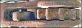
Your main subject, the lock, is sharp but the grid along with the light-colored wall that takes up a good deal of the frame isn't. The white draws my eye away from your rust area and leaves me looking at a large area of background. Using light to draw attention to the lock would help as would cropping out some of the "not main subject" areas. This would target the lock and the upper rusty area (a more interesting aspect of your composition). This light would also differentiate the hook part of the lock and punch up the the blue.
I like the fact you brought me up close to the shot. I find myself turning my head to see how it would look turned 180 degrees. I think its orientation is better as you have it -- shows off the rusty key spot and more rust is always better :)
Always great to see a new member jump into the mix. Look forward to seeing more of your photos -- jump into the commenting as well! :)
Composition: Subject Placement, Cropping, Background 3
Technical: Focus, Exposure, Lighting, Processing 6
Appeal: Is it Interesting, Motivating, Etc.? 2
How well does it meet the challenge: 10
Total Averaged Rating 5.25 Dick
Not really that interesting to me.
Composition: Subject Placement, Cropping, Background 6
Technical: Focus, Exposure, Lighting, Processing 6
Appeal: Is it Interesting, Motivating, Etc. 4
How well does it meet the challenge: 7
Total Averaged Rating(Rounded) 6
Seems like the focus is on the metal in the very top left of the photo which looks interesting, but is not the real focus of the photo, which is the lock.






 Add photograph to your favorites
 Add photographer to your favorites


