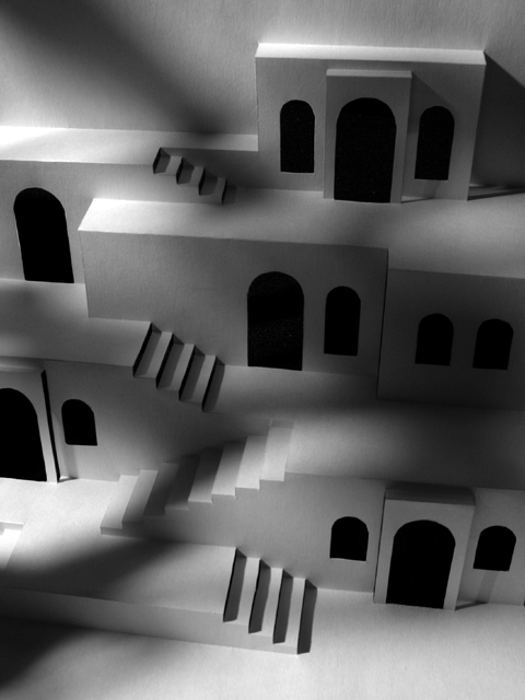
very cool image. I think this is great subject for black and white, and the shadows really make it stand out, imo. it certainly doesn't look like a single sheet of 8.5 x 11 paper (it looks MUCH larger) but I guess thats what you were going for. (9) ~mcmurma
Nice play of shadow and light on the pop-up, but I do wish that the hilights were a bit brighter -- this feels very grey. Maybe it's because I expect this to be white paper -- perhaps it isn't -- in which case the grey tones may be entirely appropriate.
The two main parts of this photo, the buildings, and the shadows, would be incredibly boring by themselves, or in any otherway. VERY good interplay of both subjects!
Cool shadows. Props for all the work you did on this. Only thing that bugs me is the perspective/angle. It isn't straight-on and makes everything seem tilted. I guess you did it on purpose, but I'd like to see a little less distortion. I think it would make the lines stand out more. 7 ~indi






 Add photograph to your favorites
 Add photographer to your favorites


