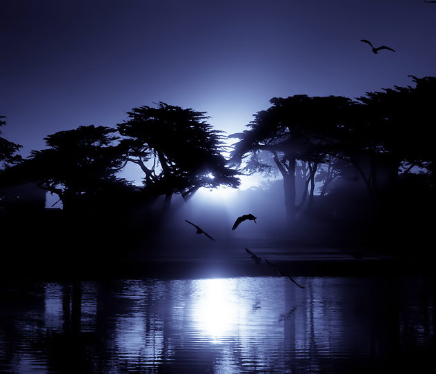
Hmmm--thought it might be a bit of shoehorn. It is blue, but artificially so. I almost held the orange(natural color) version for FS but I had a couple of other ones ready.
100+ votes and almost 7.5! I'll have to call this one an overachiever and a suprise.
[Nov. 15th, 2008 05:40:14 PM]
***
Sweet! Thanks for the votes and comments. I had been out shooting the ocean before sunrise and was headed back to the hotel when I saw a blue heron in this pond up against some reeds. I set up to shoot him and I realized the sun was peeking through the trees and this flock of gulls kept taking off, circling the area and then splashing down again. I thought the back lighting on them when they hit the water looked good and then I realized their silhouettes were also interesting (i just spelled silhouettes with out spell check!. First time ever.) This was my fav of the bunch. The heron??? Who cares? :)
Processing was convert to blue, sharpen and neat image, plus USM again.
Statistics
Place: 1 out of 186 Avg (all users): 7.6070 Avg (commenters): 8.3939 Avg (participants): 7.5410 Avg (non-participants): 7.6310 Views since voting: 21550 Views during voting: 407 Votes: 229 Comments: 79 Favorites: 71 (view)
Mark, just added this to faves. This is evocative, extremely well composed... just beautiful. Weird question, though: is the horizon slightly askew by any chance? If so, it doesn't change the photo much, but for some reason (may be just my eye) it looks like it needs to be slightly tilted to the right.
I spent the first five years of my life living in Pacific Grove...somehow I don't remember it looking this blue though...I think it was more PURPLE back then...;-)
Congrats on your Blue! Already marked this one a fav...otherwise I'd be happy to mark it twice!
I didn't vote but the color shift to blue probably would have weakened your vote with me had I did. Red would have been a more forgiving tweak given the time of day and all. Regardless of the challenge relevancy it's a sweet image. Congrats on the blue.
congradulations!! i think that this photo is really great. I looked at both the orange and blue one, and its very hard to chose which one is th ebest, they are both really great. I personally like the ornage one a lot because of the way the sun is reflecting on the water and how it looks like day and the other looks like night. But anyway good job!!! (:
I have to admit that I love the look of this, it reminds me of the moon instead of the sun and is a beautiful photo. But I do have to say in the spirit of DPC...........hmmm I wonder how I'd feel about fooling the voters.
hey Mark, you spelled silhouettes right, but missed N in convert :). But who cares, right? Congrats on a stunning image, and another well deserved (i would even say, color-matched) blue.
This is stunning. I think there's too much dead space at the top. I know you wanted to keep the top right bird, but I think the image would be more powerful without the top inch.
Just had to keep the top bird. :) I went with squarish crop to maximize the pixels.
Congrats on a superbly well done night shot that I'm wishing I can do one day. With the inspiration derived from this one I just may start trying. Thanks
Mark, I knew this one had to be yours! Awesome shot. Congrats on the blue! Very well deserved. ETA - I prefer this version over the orange one. You made the right choice!
That's pretty amazing. I especially like the 3 dimensional sensation, which might be the result of the unusual lighting, the selective focus, and the stopped motion of the birds. A great achievement with what seems like so little effort.
This is stunning. I think there's too much dead space at the top. I know you wanted to keep the top right bird, but I think the image would be more powerful without the top inch.





 Flight of Fancy
 Add photograph to your favorites
 Add photographer to your favorites


 Photographer found comment helpful.


