|
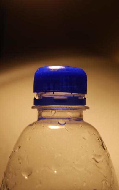
I think that too much of the clear part of the bottle was included here, and I think that it would look better if the light part were white instead of yellowish, that makes it look dirty. Also, try to place the part you want your audience to focus on (the blue cap) off-center, it creates more visual interest. |







 Add photograph to your favorites
 Add photographer to your favorites


