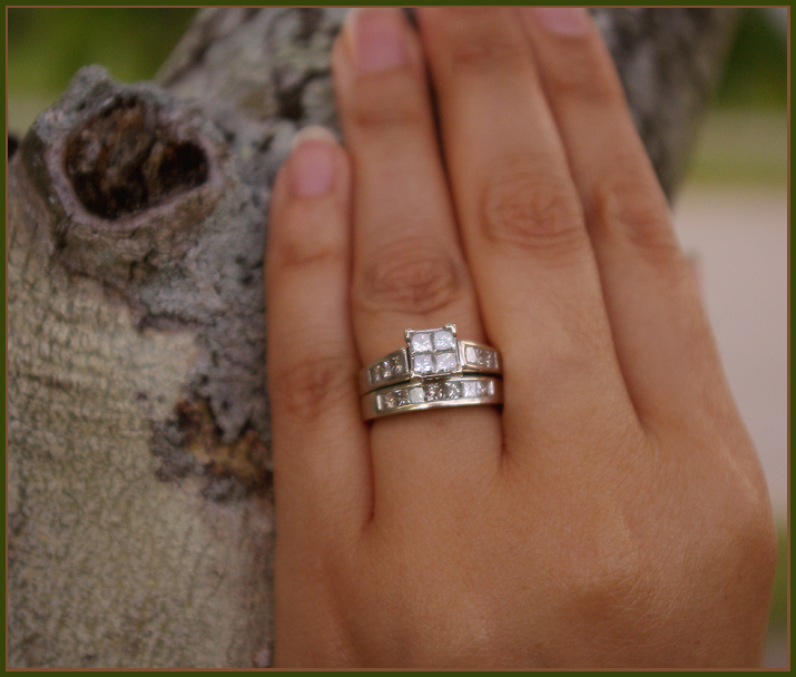
The only things that is in focus here is the ring and it is dead center... Not appealing to me but may be to other. I understand the idea and that you wanted to put focus on the challenge topic but it just doesn't look very good as is.
As much as I like the hand (it is a very nice looking hand! :)) I would have maybe opted to put the ring on a branch on the tree and tried to make it interesting. I know - maybe a bad idea but I just don't like this with the hand in it.
I'd like to see this with either more or less of her hand in the frame. As it is with the tips amputated, the crop just doesn't seem right. I do like the processing to make the ring stand out from everything else in the image.





 Add photograph to your favorites
 Add photographer to your favorites


 Photographer found comment helpful.


