tee hee I'm good - spotted you! Sheesh, reading through your comments is interesting. You got really long and detailed comments with such a mix of reactions.... interesting exercise... bet you are saying to yourself "note to self: in future beware soft focus...voters are a bit suspicious of it...". Well done on your strong finish.
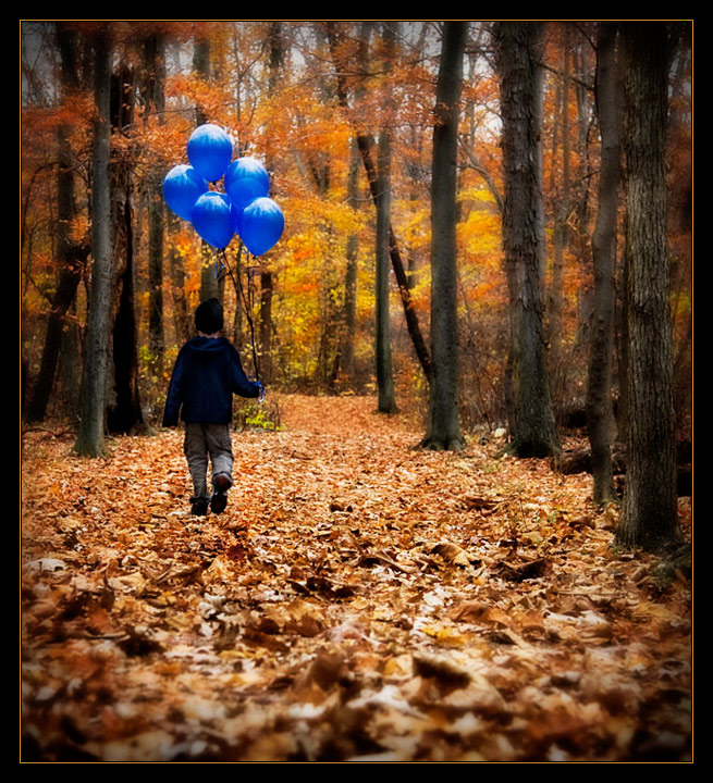
I must have suffered some deep psychological trauma as a child, because this photo scares the heck out of me! I'm honestly expecting some scary monster to jump out of the woods. Ok, let me try to figure out why... (you don't mind if I think out loud, do you?)
Alright, first the dark vignette plus black and orange border, plus blur vignette. That's probably 90% of it right there. Next, the cognitive dissonance brought on by the ultra-innocent image of a child and, of all things, balloons, surrounded by the afore-mentioned threatening elements, alone, in the woods! Ok, it can't just be me... can it?
Deep breath...
Technically, this shot is excellent. The creepy vignettes are well done, exposure, lighting, composition... all well done. Ever consider directing? Blair Witch has nothing on this photo!
Oh yeah ... 10
Even though they're blue, this reminds me of a movie I watched when I was a little kid called The Red Balloon. Love teh composition, lighting, colors, dof, well done.
I think I see a ribbon winner here... Or at least it should be. Very nice composition. Lighting is excellent. Excellent control on your depth of field as well.
I'm not sure about the processing, it's got some strange soft focus that I'm not keen on and it's also making the boy seem superimposed, which I'm sure he's not! But the image itself, I like very much, especially the colour contrast between the blue in the balloons and clothing and the browns, oranges and yellows of the forest.
Really nice setting for this and the colour standing out from the background works well. Just not sure that I'm a big fan of all of the blurring. Perhaps, having left the foreground in focus and having blurred out the background as you have it might have been better, but others will likely agree with this amount of blur to it.
It's a bit unfair to bring such a great landscape into this challenge... this accounts for the crooked title. Otherwise it's a fantastic picture of course, I love your processing.
Looking like either a Tim or Lydia image...great idea and I love the way the blues are so punchy against the autumn colours. Personally the soft focus on the yellowist leaves is distracting and my initial reaction was to blink my eyes back into focus, and then I thought my screen was dodgy, and then I saw that it wasn't. But now on second looking, the soft focus gives this a dreamlike quality which I rather like.
for some reason, blue doesn't stand out enough. It is different, definitively, but not different enough, although not sure which color to recommend instead. Nice idea, though.





 Add photograph to your favorites
 Add photographer to your favorites

 Photographer found comment helpful.


