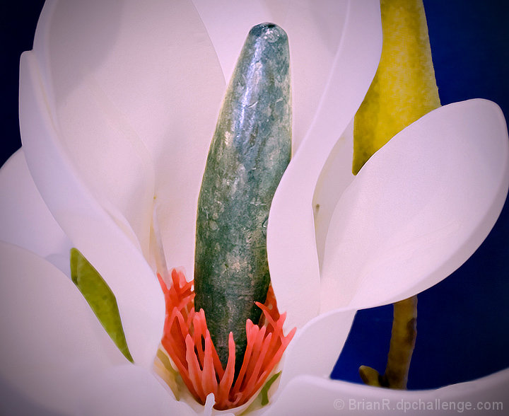
Clever. I like the concept, very funny. I have a feeling that the stem and yellow (?flower) in background could have been left out. Too distracting. Also, for my taste it is over sharpened in certain regions. Halo/outlines are quite prominent. I'm still giving it a 5 for the concept. Now go catch a fish!
Well, that's a very different approach and well executed! Kind of gets that "stock shot", "pretty" look that is loved so well in here but, fits the challenge. Nicely done!
You really went to some trouble to get this into the period table. I hope you didn't get lead poisoning in the process. The image is colorful and well exposed, but beyond that you may not score too well :)






 Add photograph to your favorites
 Add photographer to your favorites


 Photographer found comment helpful.


