Challenge:Abstract (Advanced Editing II) Camera:Nikon D70 Location: Field of abandoned cars, Hertfordshirt, UK Date: May 2, 2004 Aperture: f4.5 ISO: 200 Shutter: 1/100 Galleries:Abstract, Macro Date Uploaded: May 2, 2004
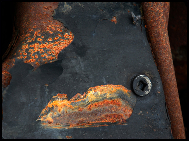
A study of rust on an abandoned car. I was attracted by the vivid colours of the rust against the fading black paint. I liked the diagonal at the right hand side, the perfect circle and square of the bolt and the more organic shapes of the flaking rust.
Cropped, adjusted levels, applied a very small amount of sharpening.
Statistics
Place: 84 out of 208 Avg (all users): 5.4023 Avg (commenters): 4.8571 Avg (participants): 5.0849 Avg (non-participants): 5.8971 Views since voting: 1842 Votes: 174 Comments: 8 Favorites: 1 (view)
IT'S A FISH! That was my first reaction when this shot came up, the nut being his eye and the rust pocket next to it his mouth, LOL!
This is an interesting shot overall, it makes me want to stop and look, trying to figure out what you are trying to say. But the dull colors of the black overwhelm the shot in the end and it makes me rather sad, not sure why though. Maybe because I keep seeing the fish and he's not smiling, I just can't quite put my finger on it.
I tried using my magic envelopes and tried different cropping angles but that didn't work either. Maybe if the contrast was bumped up just a tad to really make the rust colors pop out and the black really deep. Capturing the fly in the shot was just luck, the fish is getting ready to eat! I'm sorry but I just can't get that image out of my head now! ;)
Not sure how helpful this was but if you do make any changes to the shot, please let me know. Thanks! ;)
Good Luck In Future Challenges!
Deannda
DNeufer@stny.rr.com if you have any questions or want to discuss this further!
wellll,... this must be an outtake from the rust challenge...
doesn't fit this challenge then
how could it.... i hope i don't see it again on tuesday...
haha..
just kidding
great image... i givya an
eight
I think this might have looked more abstract without the fly. I like the fly in this photo (although it could be a bit more obvious. I think if you upped the contrast and fiddled with the hue/saturation levels, you would have a stronger design. Also, the bit of negative space along the right edge gives too much sense of depth and doesn't really add to the overall design. I don't see enough of a contast between the negative space created by the black and the shapes created by the rusty splotches.





 Add photograph to your favorites
 Add photographer to your favorites

 Photographer found comment helpful.


