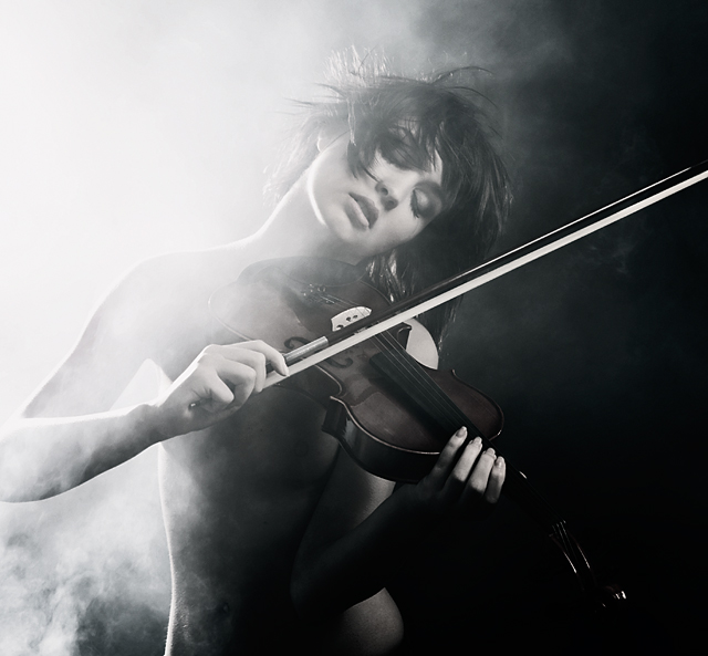
Good god what is with those low votes? It's the only photo in the top ten that I would return to see. Had I not read the comments regarding the violin position I wouldn't have even noticed the violin is position incorrectly. Honestly, I don't think it matters in the least. Had she held the violin in that more ridged position actual players hold it at it may have killed the music flowing in this image.
Very very cool photo!
But actually I was inspired by my own photo :)
//www.pbase.com/giorgi/image/95017125
But how is this for coincidences ... the model on the right side of his page, Jana, I am photographing next month in Moscow :)
I like the depth the contrast in your lighting brings to the image and prefer your more neutral toning. It's interesting to see different photographers' approaches on the same image
Proficiat on your 8th place. Excellent image. I gave it a vote of 10. I only gave two tens in this challenge and the other one went to the winning entry.
Stunning, with all due respect the top, I'm shocked that this did not win. I also agree with jmart's comment. Maybe that's why 13 voters saw fit to give you a three or less. ;0 Oh, wait a second, I think I see a hint of a breast, that explains the low votes...
Perfect Gary.... I knew this was yours should have won. I love the almost black and white look this has. If I had half your talent I'd be in a much better place!
I did not vote in this challenge but this was my pick, by far, for the blue ribbon. Once again, the dpc community showed us that the best pictures do not necesarily win the ribbons. Congratulations for this brilliant composition !! You'r a hell of a pg!!
I love this, it's so full of emotion, more so because of the fiddle I think, my favourite instrument because it can sound out emotion so clearly. The beautiful model doesn't hurt the shot either. Love the dark tones.
Crap yours is better than mine! Seriously, Awesome lighting with the black and white split, DOF is great and of course the model is cute, also. well done. i see this as a ribon
Great contrast and I like the control of the high key half. As an orchestra teacher I just have to point out that the instrument hold & position could be more convincing if she just had her pinky on top of the bow and held the instrument between her shoulder & jaw. Still, it's nice to see a good picture with a violin.
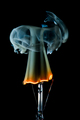
I almost loved this photo, but the way she's holding the bow is incorrect and it looks so unnatural to me that it's all I notice after a while. The photo itself is fantastic, the balance of dark, light, and smoke is perfect.
This is excellent. My only complaint: I wish she was holding the violin correctly. Like this, it looks like just a prop in her hands (which it probably is :) but I would like to be able to believe it a little).
This is a great shot. I love the concept and the implementation. I think a little more contrast would help with the depth. I like the brightness at the top left but it does seem to flatten the image a little. Trying to choose between 9 or 10... Its a tough one... this is good!





 Add photograph to your favorites
 Add photographer to your favorites

 Photographer found comment helpful.


