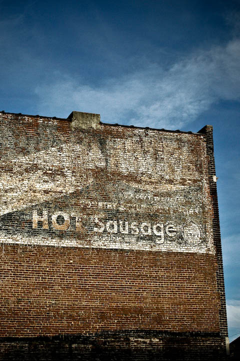
taken from a bus, but luckily we stopped right in front of this wonderful old building near the Civil Rights Museum (which I wholeheartedly recommend to everyone)
i put it through lightroom, so contrast, clarity, vignetting mostly
Statistics
Place: 102 out of 148 Avg (all users): 5.1707 Avg (commenters): 6.4000 Avg (participants): 5.5000 Avg (non-participants): 4.9452 Views since voting: 973 Views during voting: 236 Votes: 123 Comments: 9 Favorites: 0
Certainly an interesting old building; I always find old painted advertising intriguing.
The photo is a record shot, and for these to succeed well in competition they do need to be technically perfect. The composition is ok, but there is nothing dynamic about it; I see that you took this from a bus, and to a certain extent that does come across. The exposure is fine, although you might like to consider some selective dodging and burning of the paint and brickwork to enhance the detail even more - although you may feel that would take away the 'authenticity' of the photo. The sky appears fairly noisy - two possible reasons: a. initial incorrect exposure rescued in LR, or b. as a result of the 400 ISO. If it is as a result of the ISO - and I don't know how your camera performs here, I would have been tempted to increase the aperture to around f5.6 and drop the ISO to 200. The building is pretty much flat to the photographer, and as such doesn't require a large depth of field.
My over-all impressions are of a competent, although some-what uninspiring record shot that doesn't really make me want to linger. Hopefully I have given you some ideas on how you could approach the same subject were you to take the photo again. If you have any questions, please feel free to drop me a PM.
Nice minimalist approach to the topic. I'm not really connecting with it at all though. Meaning, I can't see a connection between title and image, or image with topic. That's okay, I'm sure others will get this without a problem, I'm just not your intended audience I guess. I do like the colour in this. The blue and brown work well together.
The sign looks "abandoned" but, not sure that the entire building says it??? More than anything, the subject itself is rather bland. I'm wondering if having more of the building might have helped??
Hm, not sure what to say about this. The subject, for me, doesn't really stand out in any way. It doesn't convey any emotion, doesn't even really feel abandoned except that the paint needs to be replaced. The framing leaves a little to be desired as well, the patch of blue sky running down the right side to a dark object in the lower right corner doesn't enhance this at all. I do like the colors.





 Add photograph to your favorites
 Add photographer to your favorites

 Photographer found comment helpful.


