Hello from the Critique Club.
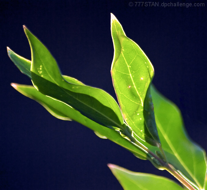
This is a bold photo, with a simple but strong composition and feel. The choice of blue background contrasts and compliments the green of the leaves well, although it might be better if the blue of the background was smoother - if I tip my screen right back, the background becomes much darker, and that looks really cool! The back-lighting is lovely, and I can quite see why you were drawn to photograph them. I do feel that the central leaf, the bright one that draws the eye, could be in a little sharper focus; that said, I can see that it is a tricky job to get sharp enough focus on the critical parts whilst still throwing the subsidiary parts into a soft blur. The diagonal composition was a good choice.
With a smoother and deeper, darker background I suspect this would have scored better. A simple subject such as these leaves needs to be technically perfect to hit the right buttons with the viewer - for me, it is a case of very nearly there. |





 Add photograph to your favorites
 Add photographer to your favorites


 Photographer found comment helpful.
