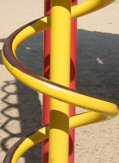
Looks like the pole is tilted clockwise slightly. I also find the shadows are a bit distracting to me. This might have done well in b/w as it would hide the playground equipment feeling.
It's got some nice qualities. The contrast is a bit blah for my tastes and in this case I think the shadow is a distracting element. It doesn't unify the design of curcving lines and verticals. It's just kind of 'there'.






 Add photograph to your favorites
 Add photographer to your favorites


