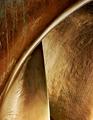
A favorite large scale (about 4 stories tall) art structure near the Phoenix Sky Harbor Airport taken against a sky background. This is the top of the structure. I have no idea what it is supposed to represent but the hot, dry weathering reminded me of global warming, hence my title.
I photographed it before for the "off center" challenge last year.
Post processing:
1-Neat Image applied to sky only.
2-Red and Yellow colors saturated on structure.
3-Added another 20% overall saturation to it to bring out colors.
4-Cloned out minor white specs.
5-Created 50% greyscale layer and used lighten and darken to bring out the texture of the structure.
6-Cropped slightly, resized and applied USM to structure.
7-Applied slight smudge to jagged edge in resized image.
Statistics
Place: 4 out of 208 Avg (all users): 6.8125 Avg (commenters): 7.5294 Avg (participants): 6.5577 Avg (non-participants): 7.1806 Views since voting: 3102 Votes: 176 Comments: 20 Favorites: 2 (view)
I thought I commented on this one, but I guess not. This was one of my faves for this challenge. I gave it a healthy 9. It is so clear, balanced and interesting. Colors are so great, too. Your lighting is bright without being harsh--a great accomplishment in my book. Excellent work! That's almost a ribbon!
!!!!!!!!!!!!!!!!!!!!!!!!!!!!!!!!!!!!!!!!!!!!!!!!!WOW!!!!!!!!!!!!!!!!!!!!!!!!!!!!!!!!!!!!Like this very much...super....just the right amount of everything, lines, compostion, excellent exposure, colors, sky (okay I would like the blue a bit richer but I can't have everything).....ribbon color? My preference so far is blue! 10. Excellent!
No offense, but I'm not sure how this sculpture relates to global warming. However, from a purely artistic POV (and ignoring the title) I like the colors and texture of the sculpture. The sky is a nice shade of blue and provides nice contrast.
I love it. I love the colors. focus and clarity are great. the angle is wonderful. The orange on blue is perfect. I'd like to see this in the top 3. Very nice.
You've picked the perfect colors for this. Very pleasant. I like the diagonal composition too. But dummy me, I must be missing something on the title - but there's no deduction for that. It's better than some that just said "abstract" for their title. Nice job.







 Add photograph to your favorites
 Add photographer to your favorites

 Photographer found comment helpful.


