Challenge:Rusted (Basic Editing I) Camera:Sony DSC-S85 Location: outdoors Date: May 1, 2004 Aperture: auto ISO: 200 Shutter: auto Date Uploaded: May 1, 2004
I wish this were a bigger image. By reducing the jpeg quality slightly it would help to make this easier to see and still retain plenty of quality for on-screen viewing.
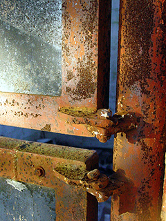
GREAT COMPOSITION. WARM LIGHT ENHANCING NATURAL RUST COLOURS.
THE ONLY NEGATIVE IS THE OVER EXPOSED AREA IN TOP LEFT WHICH TENDS TO DRAW EYE AWAY FROM BOLTS, WHICH ARE THE MAIN PART OF THE SUBJECT.
WELL DONE TO THIS PHOTOGRAPHER.
Composition: Subject Placement, Cropping, Background 6
Technical: Focus, Exposure, Lighting, Processing 7
Appeal: Is it Interesting, Motivating, Etc.? 7
How well does it meet the challenge: 10
Total Averaged Rating 7.50 Dick
Composition: Subject Placement, Cropping, Background 6
Technical: Focus, Exposure, Lighting, Processing 5
Appeal: Is it Interesting, Motivating, Etc. 4
How well does it meet the challenge: 6
Total Averaged Rating(Rounded) 5
Composition: Subject Placement, Cropping, etc. 5
Technical: Focus, Exposure, Lighting, Processing 4
Appeal: Is it Interesting, Motivating, Etc.? 4
Does this picture meet the challenge?(5pts) Yes
Total Challenge Weighted Average 4 Bill
This is just too small. I found that I wanted to give higher scores on each dimenstion, but relative to to the other entries, there wasn't enough to judge. I think larger, it would have scored quite well.
You made your image a bit small. Doesn't make a huge impact at this size. The negative space created by the double doors and the door frame is interesting.
Awesome colors, Great lightning, the only thing is the size, you might get hakked down because its too small, try to keep it bigger next time, This is very good job :)





 Add photograph to your favorites
 Add photographer to your favorites


 Photographer found comment helpful.


