Author Thread Comments Made During the Challenge
Post actions
I think you could have increased the contrast in this image
Post actions
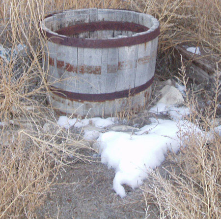
This image feels washed out. Close up with a few of the weeds blending in, this would be a very nice picture.
Post actions
Composition: Subject Placement, Cropping, Background 6
Post actions
My sympathies. Hope spring arrives soon. A little muted even for late winter.
Post actions
Composition: Subject Placement, Cropping, Background 5
Post actions
seems a little bit washed out here
Post actions
Post actions
low contrast, dull and flat looking. try using the Levels adjustment in your editor. the barrel does not seem to be in sharp focus.
Post actions
need a bit color or contrast
Post actions
Not so clear image ... maybe if there would be some sun light ...
Post actions
It looks a bit washed out on this monitor.
Post actions
Overexposure and lack of focus hurt this shot.
Post actions
Good idea but the result is a bit washed out - perhaps overexposed?
Post actions
Lacks contrast and seems wahed out - check your monitor calibration.





 Add photograph to your favorites
 Add photographer to your favorites


