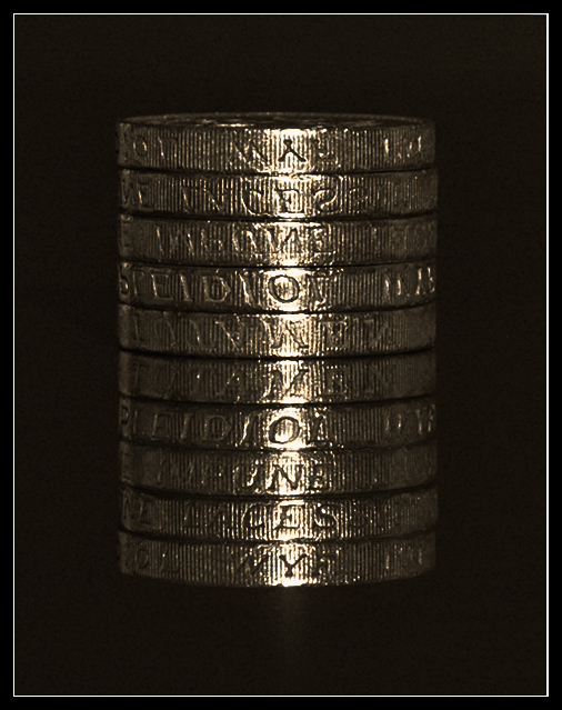
NOW I see the highlighted money/yenom thing - forgive me for being so blind. Perhaps doing a rule of thirds composition might have helped, I don't know. It's difficultl to figure out how to create composition for square/round objects like this.... Also, maybe a slightly different angle? I think I see now that this is a stack of coins - but when I first looked at it, I thought it was some sort of flat metal plaque. A different point of view might have helped voters see the cleverness of your concept here.
I saw the words money, but didn't realize it was a reflection. I gave it a 5, but doubt that it would change, even if I had know.
To me, the composition is simply to "static." It is centered both horizontally and vertically, and doesn't have a real sense of "depth" to it. You met the challenge, and it seems to be fairly well focused, but beyond that, there isn't much to compel the viewer to ponder it longer.
The glare on the edge of the coin is quite evident and draws you from the writing on the edge. A little more light in general and taking that glare away would improve this IMO.






 Add photograph to your favorites
 Add photographer to your favorites

 Photographer found comment helpful.


