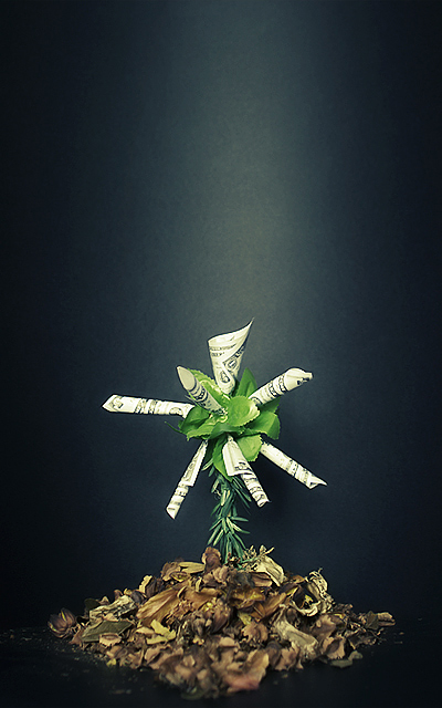
Money tree? For me this has too much dead space and the money is so small that the message is lost. There seems to be a light stripe down the image. Perhaps a spot would have been better? A little more contrast might have helped as well.
Good composition and great lighting. The dark BG created a very nice contrast against the white (notes) and the green. Clever use of dried leaves added a nice touch of brown color to the composition. Nice.
Great lighting, framing, colors. The bit at the bottom that is way less in focus than the rest is a bit distracting, I think it would look even better without selective focus. Very nice.







 Add photograph to your favorites
 Add photographer to your favorites


 Photographer found comment helpful.


