This is, by far, one of the best shots of the challenge. The voters, as usual, tend toward stuff that would be better suited to a 70s album cover. Great shot nonetheless!
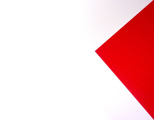
It looks too much like a flag to be an abstract! i know it's NOT a flag, but it looks too much like what it isn't to not be, from my point of view. It's a very modernist piece of art, which i'm sure galleries would love. But is it really photography? I mean, the only real slight flaw is loss of pure white in the top right. Paradoxically, for some thing so simple and comprising of only two colours, this is the hardest image one to vote on this week. Is it too abstract? For art, 8. For a photo - 2.5. That's an average of, oh, about 4.5. 5 it is. dang it, 6, coz i DO like it.






 Add photograph to your favorites
 Add photographer to your favorites

 Photographer found comment helpful.


