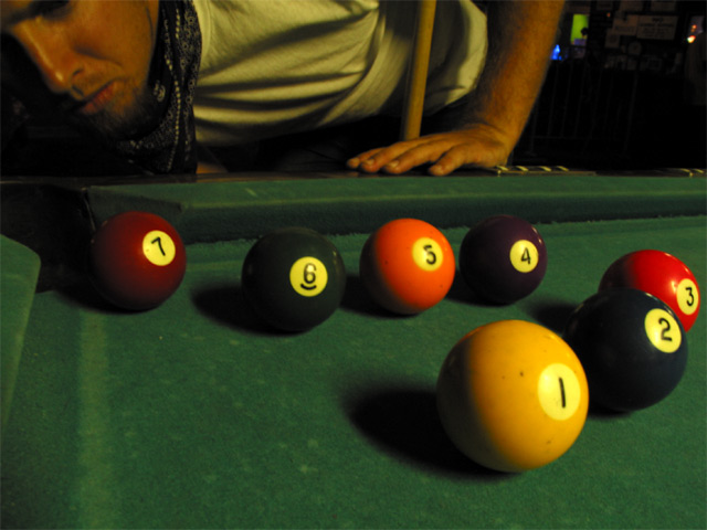
I would like it better if the numbers didn't line up. I think it would make it more natural. It also seems a bit fuzzy (face) but otherwise I really like it.
Just fire it into the corner, you're bound to get one of them in. :) I like the angle and framing/cropping of this shot. The set up could use some work though. It looks TOO set up in my opinion. I think that the numbers all facing the camera is a bit odd and unnatural looking. your lighting source is great. You did a good job of keeping harsh glare off the balls. Nice shot. Good luck in the challenge. ~Hbunch7187~
There's alot of potential with this idea. I'm no photography gearhead, can't suggest what to do interms of lightmetering, field depth etc, but from an aesthetic point of view this appears a little flat.
too dark.. a brighter light would have made the colors stand out more and the shadows on the table much more effective and drawing. Also I'm not sure if I like the pose of the guy in back and the parts of him that are shown, cut out. Perhaps a little bit more complete view of him, or an even more minimalistic suggestion of his presence. Good idea, but the technical side needed some work. 5 wingy
balls set up a little too organized, looks staged, sorry but that's a pet peeve of mine. either it's set up and that doesn't matter, or it's candid and not staged, and never the twain shall meet. but that's just me. you did a nice job.






 Add photograph to your favorites
 Add photographer to your favorites


