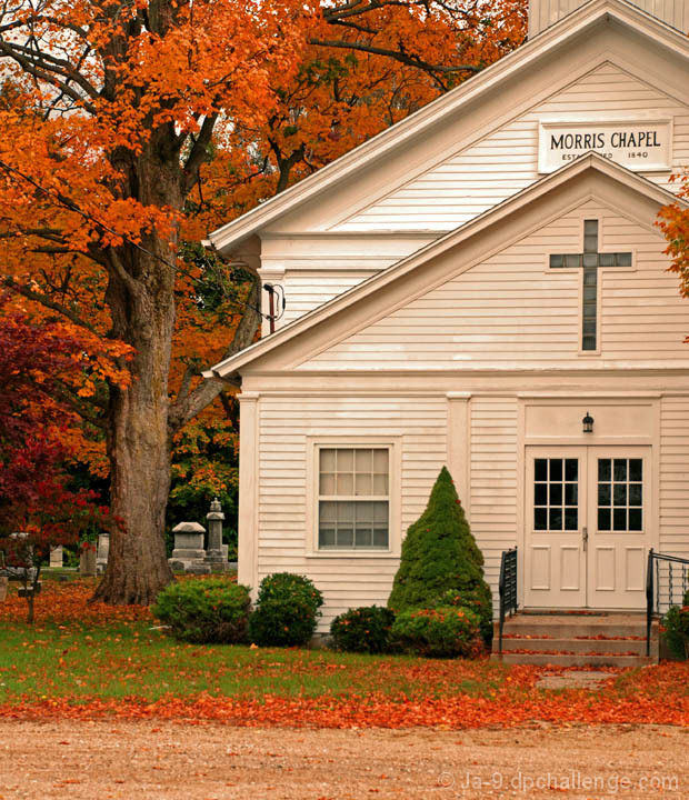
i really liked this photo the second i saw the thumbnail(that is what they're called right?) excellent color, great contrast and tones in the building, pretty well cropped, although i might have let a little bit more tree show. nice nice photo, looks like a wonderful area that you captured wonderfully:D
first impressions are pretty colors and nice quaint church
i agree with FocusPoint on several points - the tip of the roof being cut off is a small issue that makes it feel unfinished in some way, the lack of consistency of the whites in the church give an almost dirty feel to the building, and the foreground brown strip adds little to nothing to the image
In addition, the doorway being so far to the right gives it a slightly unbalanced feel.
The main thing that bothers me is a lack of sharpness of focus for the Church - a bit of unsharp mask or smart sharpen makes a world of difference.
It is a decent image as can be seen from the histogram of voting - squarely sitting around 5 with no high votes (8-10) and little to no low votes (1-3), but overall the image has little "wow' factor to really draw the viewer in to stay and look.
Let me start saying, nice photo... Colors are giving the "wow" thing when I see it first time. Why this photo didn't do better? Let's analyze,
Paint on the building, some of the panels are whiter than others, the top roof is cut off a little. I think there is too much road on the bottom. Colors are good, could be bit sharper and cropped a bit more. Also if you did stepped to your right more, you could get rid of the wire pole top of the first roof.
You did capture the colors though, very bright and nice. If technically be better, you probably could get around 5.5 or 5.8 for this one :/
I checked your photos, for a first challenge, very nice. Mine was around 4 :/ also, I see you are trying to develop a better photographer's eye, just make sure the backgrounds will be jumk free... and keep them tight and clean :) of course I am talking about your photos LOL.
Nice subject...where's that located? LOL! The white balance looks off,(maybe temp). I've entered this church before in a challenge ... I didn't vote, I would have known who's this was and would have had to skip it.
A tiny bit more space on the right hand side would have looked better balanced. However that said the colours and over all feel of the picture looks good.





 Add photograph to your favorites
 Add photographer to your favorites

 Photographer found comment helpful.


