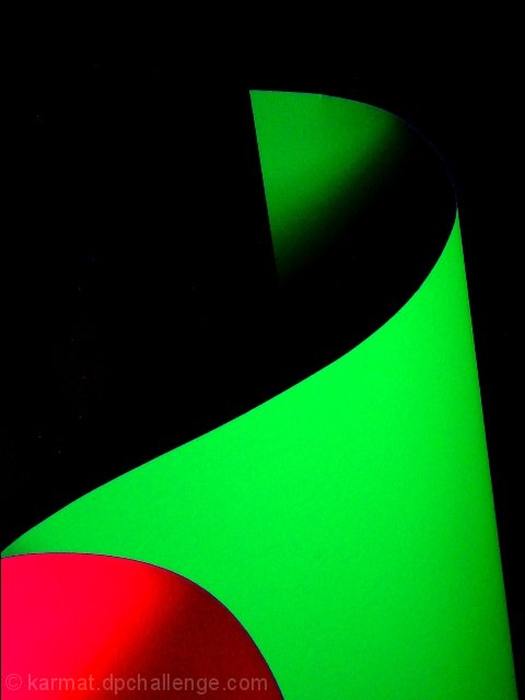
Awesome abstract! I love all of the striking contrasts, curves, and shadows! 2 nitpiks...the red appears a bit hot in one spot and there's a dent in the green by the top of the image :P ...otherwise perfect! -9 Lisa
Funny. Is that posterboard? The pic looks very posterized for some reason. It just adds to the effect tho. The colors and shapes are very appealing. Nice job. ~indi
Humph. Very nice. I like the curves and how the shadow forces the top to be dissappeared into the background. I am not sure if it's crop or noise or the cardboard but looks like there are patches of stuff on the card (maybe jpeg issues?) 8 paganini
excellent example of graphic design here! the colors are very vivid as are the demarcations between light and shadow. the use of negative space is equisite, as is the color gradient in the red section at the bottom. im assuming these are sheets of paper? one of the cleanest abstracts ive seen in some time. 8. mag99
simple and pretty, strong eight. and i bet you had a good entry for the negetive space challenge a couple weeks back, you know how to fill a rectangle.









 Add photograph to your favorites
 Add photographer to your favorites


 Photographer found comment helpful.


