| Author | Thread |
|
|
11/09/2008 11:13:19 PM |
|
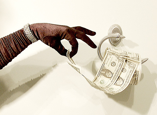
I always enjoy seeing your entries in these challenges, Susan - you often put so much effort and thought into the set up. Another funny take here, and I can appreciate your difficulties with minimizing those shadows - no you didn't beat them, but you put in a valiant effort. I wish I could give you a tip here to help for the future, but the issue has me a bit stumped too. :) |
|
 Photographer found comment helpful. Photographer found comment helpful. |
|
|
11/05/2008 06:53:30 PM |
Great idea! Sorry I missed it in voting. I like your location description as well.
Message edited by author 2008-11-05 18:54:26. |
|
| Photographer found comment helpful. |
|
|
10/29/2008 07:57:39 AM |
Susan, I really liked this shot and gave it a high score. I haven't read the other comments, so I can't imaging why there were so many low ratings. Your idea is wonderful, and you executed it quite well, IMO. I'm just not quite sure about the shadow. I spent a bit of time trying to decide if they were good or not. So I guess that means they were distracting. I love the glove and bracelet, and the position of the hand is perfect. The roll of ones is convincing too. I think it is hilarious to be using TP with a fancy glove on. Oh, great title too.
eta: I have not read the other comments, and I disagree with the ones that said the contrast is too strong. I like High Key images, and I think that style fits your idea very well.
Message edited by author 2008-10-29 08:01:34. |
|
| Photographer found comment helpful. |
|
|
10/29/2008 03:30:24 AM |
|
LOL! This is hilarious! I didn't make it through the challenge for voting so I missed this one. Very nice! Look forward to the outtakes, and love the write-up of how you did this. |
|
| Photographer found comment helpful. |
Comments Made During the Challenge  |
|
|
10/28/2008 06:38:42 PM |
|
Too sharp. It's not solid enough. I like the idea though. I was thinking of doing it myself. |
|
| Photographer found comment helpful. |
|
|
10/28/2008 05:16:38 AM |
|
I liked the sense of silliness. I wondered how the picture would have looked with less contrast and softer lighting. The title adds to the image |
|
| Photographer found comment helpful. |
|
|
10/27/2008 04:42:54 PM |
|
LOL! A bit too contrasty for my taste, but wonderful idea. |
|
| Photographer found comment helpful. |
|
|
10/25/2008 11:10:22 AM |
|
Like the idea, not crazy about the lighting. |
|
| Photographer found comment helpful. |
|
|
10/25/2008 07:44:09 AM |
|
great idea, perhaps the black glove is to present |
|
| Photographer found comment helpful. |
|
|
10/24/2008 07:50:09 PM |
|
I hate those One's. They're so scratchy! Love the lighting. |
|
| Photographer found comment helpful. |
|
|
10/24/2008 01:47:28 PM |
|
| Photographer found comment helpful. |
|
|
10/24/2008 01:41:04 PM |
|
Haha, I like this idea a lot, but it seems a little overexposed. The shadows are also a bit distracting. |
|
| Photographer found comment helpful. |
|
|
10/24/2008 07:06:55 AM |
|
Funny and creative out of the box thinking is what I like about this one. Also well presented from a technical point of view. |
|
| Photographer found comment helpful. |
|
|
10/23/2008 02:41:33 AM |
|
haha. very creative. Just a little too overexposed. The dollars look a bit blown out. I love the idea though- and composed well too. |
|
| Photographer found comment helpful. |
|
|
10/22/2008 01:45:27 PM |
|
Good take! 8 for creativity! |
|
| Photographer found comment helpful. |
Theme:
Classic /
Light /
Dark
Home -
Challenges -
Community -
League -
Photos -
Cameras -
Lenses -
Learn -
Help -
Terms of Use -
Privacy -
Top ^
DPChallenge, and website content and design, Copyright © 2001-2026 Challenging Technologies, LLC.
All digital photo copyrights belong to the photographers and may not be used without permission.
Current Server Time: 10/14/2026 10:38:19 AM EDT.





 Add photograph to your favorites
 Add photographer to your favorites


