I'm not that suprised at the relatively low score of this one (but I have many shots scored way lower than that).
The DOF and subtle light are perfect, but...
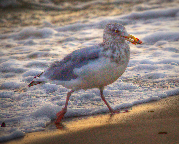
*The noise is problematic, especially the red component of it. I personally don't like color noise, in my mind this is associated to "low quality P&S/phone". I understand that you decided to add this noise, which is your own choice, fine. But it would probably have scored better if you only added luminance noise instead of color noise. Luminance noise can sometimes fool the viewer into thinking "grain", while color noise most of the time can't.
*Framing. (I am coming from a part of the world where we write from left to right, so Arabic or Asian people might have a different opinion on this)
The gull is going to the right, and his head is aligned on the upper right Rule of Third point. But as it is moving, I know that he is going to the right. The problem is that his head is already quite close to the right border of the frame, and he doesn't have much space to move within the frame. When looking at this pic, I then have the feeling that the gull will soon go out of the frame, leading me to already reconsider the picture without the gull in it. Having more empty space on the right would have allowed me to have a better, more "static" look at this picture.
Hi Bear! I am so glad I gave this shot a 9, despite/because of the noise. It's a lovely shot, great motion, and the textures add an almost otherworldly quality. Well done, wish it had scored higher!
This is one of those shots you do for yourself - win or lose. It's a beautiful piece of work Robert. The "noise" adds an element that fits perfectly with this.
This is a great shot, but I find the colour noise level too distracting - there is a lot of red noise coming up on the bird that harms the shot. Otherwise its a fabulous capture, love the light and the bird's stance
I like the painterly effect of your photo.. and think that gulls are under appreciated as they are truly beautiful birds and so graceful in flight.. I like the grain in this shot and the soft muted tone.. it looks like you bumped the colors up a fair bit and that worked well with the blue and the yellow..but not as well with the red - the red in the bird's feet, it's beak and whatever it is holding in it's mouth look a bit off, maybe taking the red down a bit in your pp would have been a better choice, keeping true to the painterly effects the rest of your photo has.
This image suffers from a LOT of colour noise.
Grain in black and whites, I really like. But chroma noise is simply not pleasing.
Colours also seem pumped a bit looking at the beak area.
Image itself is nice other than those issues.





 Add photograph to your favorites
 Add photographer to your favorites

 Photographer found comment helpful.


