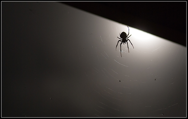
My main problem with this is the harsh line across the top right, I like the silhoutte and I like the lighting but that triangle is really distracting.
I think this either needs more color or to be a true black and white image... as it is, it just seems muddy to me. Needs more contrast, I think, to score more highly. 5






 Add photograph to your favorites
 Add photographer to your favorites


 Photographer found comment helpful.


