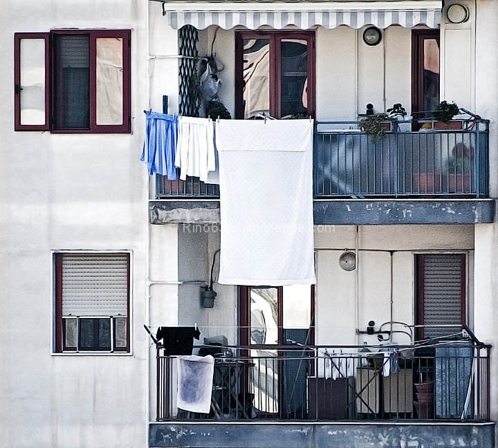
develop the raw. in photoshop: rotation and crop, lucis art, S&H, new level convert in black and white overlay and reduce the opacity to 42%, reduce noice, smart sharpen,brightness and contrast.
Statistics
Place: 28 out of 74 Avg (all users): 5.8023 Avg (commenters): 7.0000 Avg (participants): 5.5000 Avg (non-participants): 5.8741 Views since voting: 1078 Views during voting: 336 Votes: 177 Comments: 12 Favorites: 0
Well your photo did certainly well in the challenge. Congrats.
What this photo has going for it:
Amazing geometrics and an interesting mix at that. One window open, one closed, towels hanging from the rail, lines going up and down, they all make for a good photo. It is all nicely composed too, you used the frame wisely. I like the square crop.
Scoring better:
Just some ideas if you were looking for a better score, ignore this if you were not. Usually high key/bleached photos do not tend to do as well unless it is a portrait shot. You might try using a wider tonal range. Matra here, the less noise the better, (probably because of the crop)? Anyhow, if scores are not your concern just ignore this. I personally like the bleached effect here.
Things to consider in the future:
Some things I would like to see. A single person would add so much to this photo. Whether they are peaking out the window or standing on the balcony. Maybe that absence was your intent. Not sure if you heard the saying, odd numbers are more pleasing to the eye. Not sure how much of that is real, but perhaps something to consider in the future.
To Sum Up:
Personally, I think it is a wonderful photograph with a lot going for it. 5.8 is a terrific score and you should be happy. I gave some tips on what I think you could do for a better score, but take that with a grain of salt. The last part is more of a reflection what I like to see in a shot and is a matter of personal preference and in no way impacts this wonderful shot.
Interesting juxtaposition of tonality - the walls and the site background, making it difficult to be quite sure where the image ends and the site begins. I'm not sure the New Worlders won't think you're outside the challenge guidelines either - perhaps more urban than sub-. Excellent sense of composition though.





 Add photograph to your favorites
 Add photographer to your favorites

 Photographer found comment helpful.


