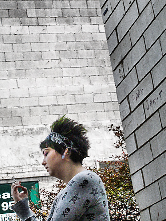
A few things about this: I tried it in black and white, but I couldn't stand losing the patch of green hair, brought out by the "For Lease" sign (cropped) and the foliage. Also, I did prepare a noise reduced version of this, but it looked awful next to this one. A little bit of grit and grain seemed to not only hold up here, but also enhance this.
Damn it! I can't see the full picture without scrolling! I think it rocks. I think it's prob better in colour as the patch of Green on her, the foliage and sign break the claustrophobic grey. This is really cool.




 Add photograph to your favorites
 Add photographer to your favorites

 Photographer found comment helpful.
